UI/UX Design Principles That Increase Conversions: A Designer's Deep Dive
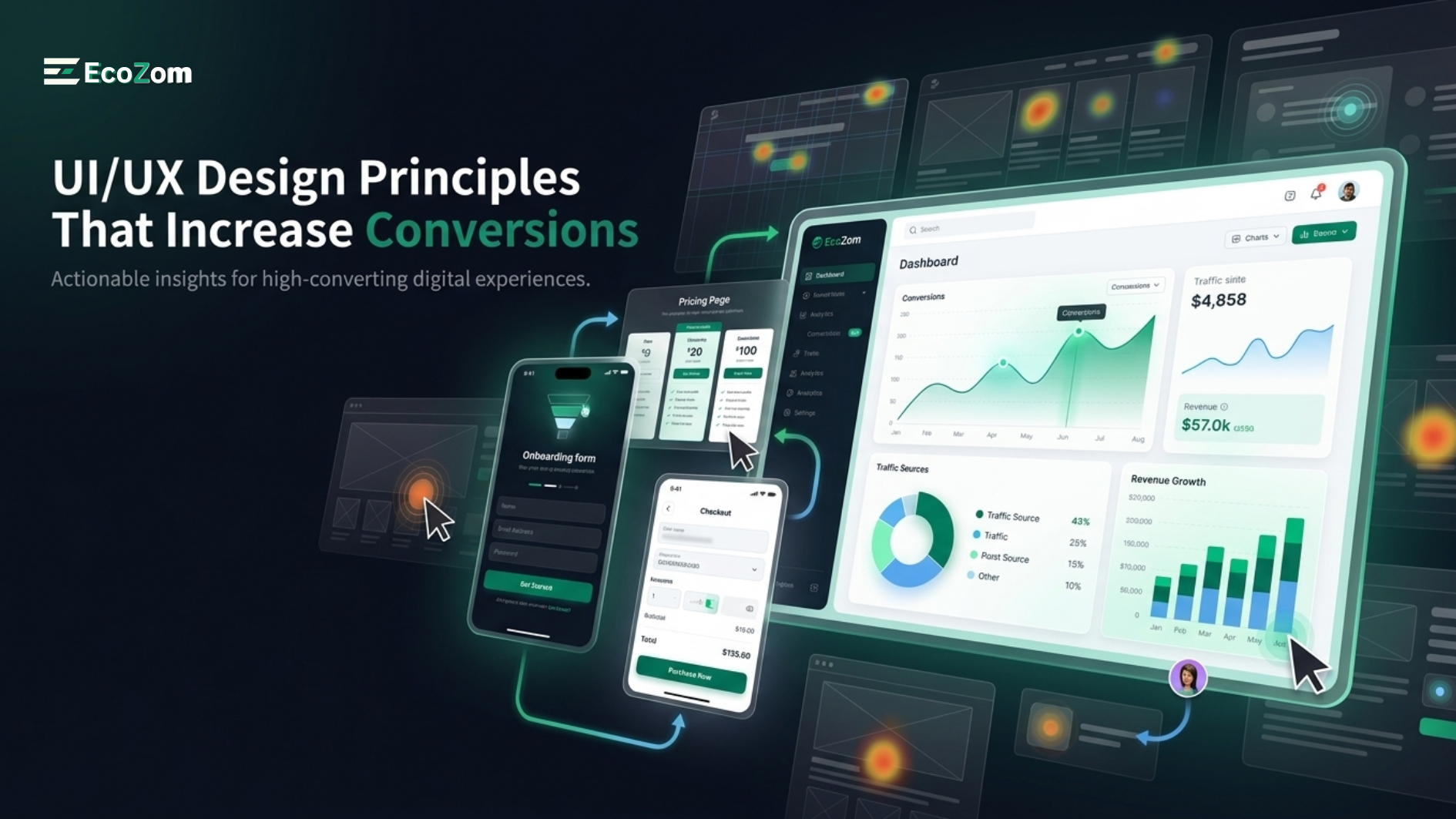
UI/UX Design Principles That Increase Conversions: A Designer's Deep Dive
The difference between a 2 % conversion rate and a 10 % conversion rate on the same website, with the same traffic, is almost always a design problem. User Interface(UI) and User Experience(UX) design are the disciplines that transform passive visitors into active customers — not through manipulation, but by removing friction, building trust, and guiding users naturally toward the decisions that serve both their needs and your business goals.
This in -depth guide explores the proven psychological and technical principles that high - converting websites share, with actionable implementation guidance that any business can apply immediately.
The Psychology Behind High - Converting Design
Cognitive Load Theory
The human brain can consciously process only 7±2 pieces of information simultaneously.Every additional element on your page competes for cognitive resources.High - converting designs ruthlessly minimize cognitive load through:
- Progressive disclosure: Revealing information only when users need it, rather than presenting everything simultaneously
- Chunking: Grouping related information into digestible units (forms broken into steps, feature lists grouped by benefit category)
- Recognition over recall: Showing options rather than requiring users to remember them (dropdown menus versus blank text fields)
- Familiar patterns: Using conventional UI patterns that users already know (hamburger menus, underlined links, cart icons) to eliminate learning curves
Fitts's Law: Click Target Science
Fitts's Law mathematically describes the relationship between the size of an interactive target, its distance from the cursor/finger, and the time required to click it. The practical implications for UI design: make your most important CTAs larger (minimum 44px height on mobile), position primary actions closest to where the user's attention naturally rests, and use generous padding on interactive elements to expand the effective click area beyond the visible boundary.
Hick's Law: Decision Paralysis
The time required to make a decision increases logarithmically with the number of options presented.This is why Netflix limits its recommended rows to 10–15 items despite having thousands of options, and why conversion rate optimization practitioners consistently find that reducing form fields and navigation options increases completion rates.Every unnecessary option is a conversion killer.
Information Architecture: The Foundation of Usable Design
Information architecture(IA) is the structural design of how content is organized, labeled, and navigated.Poor IA is the most common cause of users failing to find what they are looking for — leading to bounces and abandoned conversions.Effective IA principles:
- Card sorting: Conduct card sorting user research sessions where real users organize content into categories, revealing their mental models rather than imposing the designer's assumptions.
- The three - click rule(evolved): While not a strict rule, important content should never be more than 3 navigational steps from the entry point.
- Consistent labeling: Use the same terminology throughout navigation, page headings, and content. "Pricing" and "Plans" referring to the same thing creates confusion and erodes trust.
- Clear categorization: Navigation categories should be mutually exclusive and collectively exhaustive — every content item fits clearly in one place.
Color Psychology in Conversion Design
Color is the fastest - processed visual information — the brain categorizes color 60,000 times faster than text.Strategic color use in conversion - focused design means:
- CTA color contrast: Your primary call-to-action should be the highest-contrast, most visually distinctive element on the page. The specific color matters less than its contrast against the surrounding elements — orange on white, green on dark gray, deep blue on cream all work because of contrast, not because of color-specific psychology.
- Trust - building colors: Blue remains the highest-trust color in most Western and Middle Eastern markets (used by PayPal, American Express, healthcare providers), while green signals safety and "go" for purchase buttons. Red creates urgency but also caution — use sparingly for error states and limited-time offers.
- Brand consistency: Your primary brand color should appear throughout the conversion path to create the psychological association between your brand and the positive experience of the site.
User Flows and Conversion Funnel Optimization
Mapping the Happy Path
Every conversion has a "happy path" — the ideal sequence of steps a user takes from landing to completing the desired action.Map this path explicitly, then systematically identify and remove every possible friction point.Common friction sources include:
- Requiring account creation before purchase(offer guest checkout)
- Long forms with irrelevant fields(reduce to absolute minimum required data)
- Unclear error messages that don't tell users exactly what to fix
- Missing trust signals at conversion points(no security badge near payment input)
- Slow loading at critical conversion pages(every 1 - second delay reduces conversions by 7 %)
The Principle of Commitment and Consistency
Cialdini's principle of commitment and consistency reveals that people are more likely to complete an action if they have already taken small initial steps toward it. Apply this in UX through:
- Multi - step forms that start with easy, non - threatening questions(email address, not credit card)
- Onboarding flows that collect user data progressively as they engage with the product
- Wishlists and saved items that create investment before purchase commitment
- Free trial flows where users set up their account and experience value before any payment conversation
Micro - Interactions: The Difference Between Good and Great
Micro - interactions are the small functional animations and responses to user actions that collectively define the polish and responsiveness of a digital product.Examples include: the haptic feedback when you follow someone on Instagram, the satisfying checkbox animation when you complete a task, the loading state on a button after clicking, and the error shake when entering an incorrect password.Well - designed micro - interactions:
- Provide feedback confirming the user's action was registered
- Guide attention to what changed on the page
- Create emotional delight that increases engagement time and return visits
- Communicate system status during loading states, preventing user uncertainty
Mobile UX: Designing for Thumbs
Mobile user behavior is fundamentally different from desktop.Users interact with phones primarily using one thumb, one-handed, while distracted.Mobile UX principles that translate directly to conversion improvement:
- Thumb zone design: Place your most critical interactive elements (navigation, primary CTA, back button) within the natural reach arc of the right thumb — the lower-center and right side of the screen.
- Sticky CTAs: Keep your primary call-to-action visible at all times on mobile through sticky headers or floating action buttons. Users should never need to scroll back to the top to take action.
- Input optimization: Specify the correct input type for every form field (tel for phone numbers, email for email, number for quantities) to trigger the appropriate mobile keyboard.
- Touch gesture support: Swipe for carousels, pinch-to-zoom for images, pull-to-refresh for content feeds — support native gesture patterns rather than forcing click-based interactions.
A / B Testing Framework for UX Decisions
Gut instinct and best practices provide direction, but only data confirms what actually works for your specific audience.An effective UX A / B testing framework:
- Test one variable at a time(headline OR hero image OR CTA text — never all three simultaneously)
- Run tests until statistical significance(95 % confidence) is achieved — typically 1,000–5,000 conversions per variant
- Test in order of potential impact: CTA copy and placement first, then hero content, then form flow, then color changes
- Document all test results, including failures — negative results prevent repeating unsuccessful experiments
Frequently Asked Questions About UI / UX Design
What is the difference between UI design and UX design ?
UX design is the research - driven process of mapping user journeys, removing friction, and structuring information to achieve goals.It results in wireframes, user flows, and interaction specifications.UI design is the visual execution — applying brand identity, color, typography, and visual design to those wireframes to create the final interface.Both disciplines must work together: great UX with poor UI loses users to aesthetic disappointment; great UI with poor UX loses users to confusing flows.
How much does professional UI / UX design cost ?
A comprehensive UX research and design engagement for a product typically ranges from $10,000 to $80,000 + depending on the complexity, number of screens, and research depth required.Investment in professional UX design consistently yields 10–100x returns through improved conversion rates and reduced development costs(fixing UX problems during design costs 10x less than fixing them post - development).
Design Experiences That Convert and Delight
Our UI / UX design team combines behavioral psychology, data analysis, and exceptional design craft to create digital experiences that consistently outperform industry conversion benchmarks.From UX audits and redesigns to full product design systems, we help businesses achieve measurable results through design excellence.
Request a free UX audit of your website or app and receive specific, prioritized recommendations for your most impactful conversion improvements.